Days Left
ShippedmacOS menu bar utility that makes the year's urgency visible: one number, always in front of you. Built on a market gap with 880K followers and no product.
Solo Builder · Personal · 2025
- Instagram followers, no app
- 880K
- Views on one tweet
- 2.5M
- Product Hunt #1 upvotes, 2018
- 617
- Reviews on the top Mac app
- 5
Problem
Most people drop their yearly goals early because the year feels abstract.
What I built
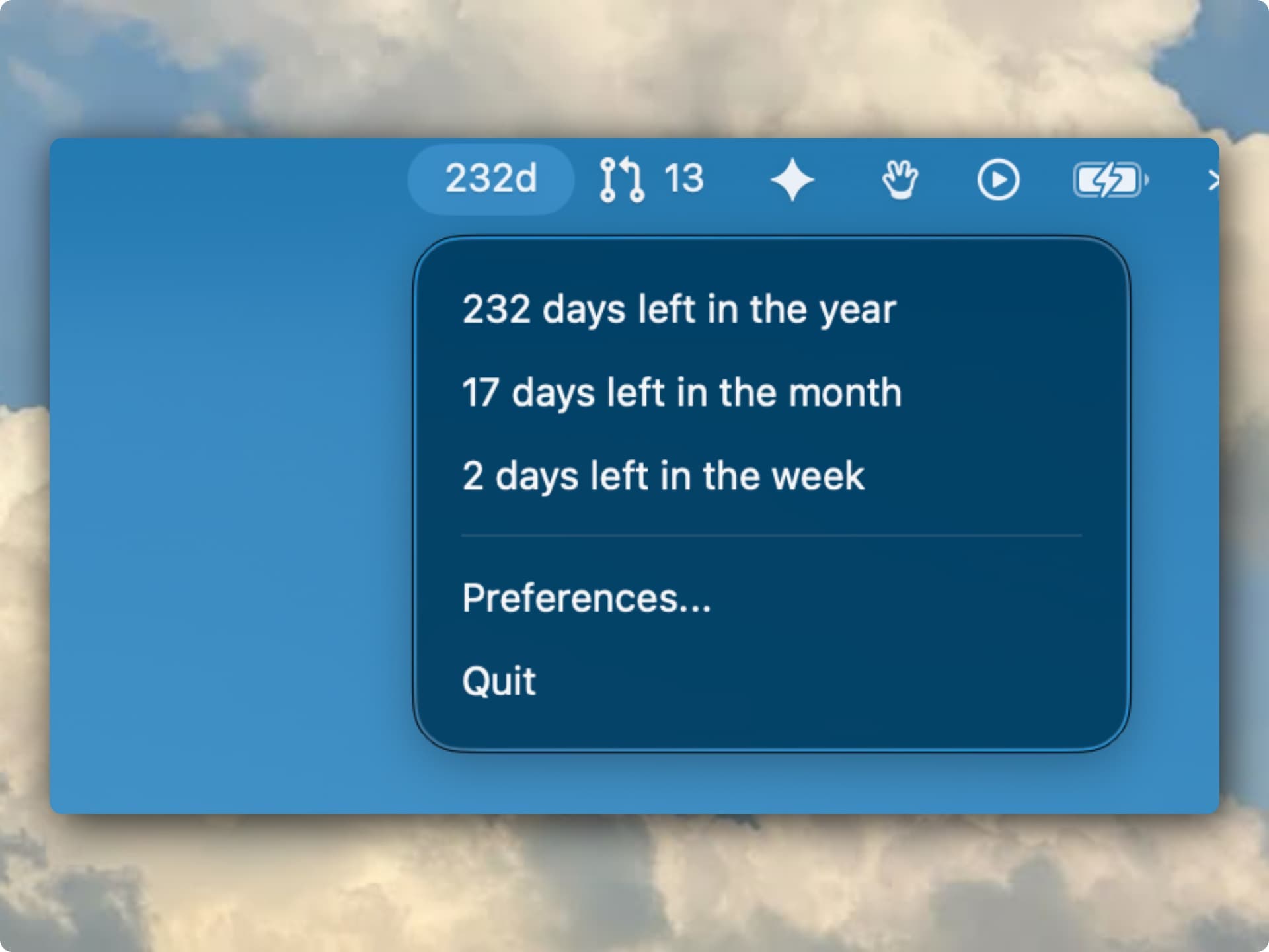
A macOS menu bar app that shows how many days are left in the year.
Result
One quiet number, always in view, with month and week counts one click away.
What it does
01
Loss-Aversion Framing
Counts down the days left in the year.
02
Cascading Urgency View
Days left in the year, month and week in one click.
03
Always-On Ambient Signal
Always visible in the menu bar.
04
Calm by Design
A calm number that never nags.
Tech Stack
All projects- Swift 6
- SwiftUI
- macOS
- ServiceManagement
- XCTest
 Swift 6
 macOS
Read the full write-up2 min read
The problem
91% of people abandon their annual goals by February. They still care; the year just goes abstract. The days slip by invisibly. People only feel the urgency when it's already December. The demand signal is enormous: a single @year_progress tweet saying '2024 is 50% complete' got 2.5M views and 26K likes. @progressbar_ built 880,000 Instagram followers posting nothing but year-progress content, with no product attached. Progress Bar OSX hit #1 on Product Hunt in 2018 with 617 upvotes and was never meaningfully updated. The highest-rated year-progress app on the Mac App Store today has 5 reviews. The Mac slot for this is open.
Highlights
- Chose 'days remaining' over elapsed percentage. Loss aversion research (Kahneman) makes remaining-days framing hit 2x harder; every competitor defaults to elapsed %
- Stacked year + month + week view creates cascading urgency. The week level changes today's behavior, the year level is the emotional anchor; no competitor surfaces all three
- Calm design with no color changes or alarms. The number speaks without judgment; color-coded urgency feels like a scolding and trains users to dismiss it
- Identified the distribution gap: @progressbar_ has 880K Instagram followers posting year-progress content with zero product attached; Mac App Store slot is wide open
What I built
- Loss-Aversion Framing
- Shows days remaining, not elapsed percentage. Psychological research on loss aversion (Kahneman) shows that 'only 47 days left' triggers 2x the behavioral response of '87% complete.' Every competing app gets this backwards.
- Cascading Urgency View
- One click reveals days left in the year, the month, and the week, stacked in one popover. The week level changes what you do today. The year level is the emotional anchor that makes the week level matter.
- Always-On Ambient Signal
- The number lives in the menu bar through every task, every context switch, every distraction spiral. No app to open, no action required. The friction of 'checking' was the product's main competitor.
- Calm by Design
- No color changes as the year depletes, no alarms, no nudges. The number speaks for itself. Urgency that doesn't feel like judgment gets used daily. Urgency that scolds gets quit-at-login turned off.
Related Projects
Interested in working together?